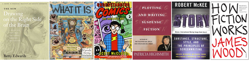
Following Saturday’s Guardian Masterclass, we thought we’d share some of the books the tutors recommended to up-and-coming graphic novel creators. These six quite different books form a useful reading list for anyone interested in writing or illustrating graphic novels.
In advance of Saturday’s ‘How to Write a Graphic Novel’ masterclass, curated by SelfMadeHero for The Guardian, we asked four of the event’s speakers to recommend a key text to budding graphic novelists. Here’s what they had to say:
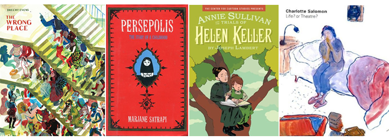
Audrey Niffenegger, Writer and Artist
Life? or Theatre? by Charlotte Salomon
“I admire it because she was inventing a form to contain her life, the book is strange, honest, and extremely original. It was made long before the notion of a 'graphic novel' took hold, and so she followed no rules and the book is the result of her need to tell (and show) her story.”
Paul Gravett, Writer
Annie Sullivan and The Trials of Helen Keller by Joseph Lambert
“In what is much more than a historical graphic biography, Lambert uses the visual/textual alchemy unique to comics brilliantly to convey the interiority of a blind, mute little girl’s halting, gradual awakening to the outside world and to her place in it, and the depth of caring and resolve of her tutor Annie Sullivan who takes her there.”
Pat Mills, Writer and Creator of 2000AD
Persepolis by Marjane Satrapi
“It’s a great story with identifiable characters and superb art, and it demonstrates how “political” themes can make excellent drama. ”
Karrie Fransman, Writer and Artist
The Wrong Place by Brecht Evens
“The Wrong Place demonstrates just the right balance of good storytelling and dialogue mixed with stunning painted visuals. In addition, it manages to break out of the usual ‘panels and speech bubbles’ formula while remaining readable and coherent.
“I’d also recommend getting your hands on a copy of the Blab anthologies published by Fantagraphics. They have an amazing mix of media and really demonstrate the potential of the medium: collage comics, history comics, painted and printed comics and even graphic journalism. Lots of inspiring stuff!”
Tickets are still available for the masterclass, which runs from 9am to 5pm this Saturday (7th September). To find out more – and to book tickets – click here.
Masterclass_new blog.jpg232.37 KB Next Saturday, 7th September, SelfMadeHero and The Guardian will host a masterclass in writing for graphic novels. Featuring some the industry’s biggest names, this day-long event will feature an introduction to the form by comics expert Paul Gravett (1001 Comics You Must Read Before You Die), a keynote speech by Audrey Niffenegger (Raven Girl, The Time Traveler’s Wife), and workshops led by creators Karrie Fransman, Pat Mills and Andrzej Klimowski.
As well as providing an insight into the working practices of some of the world’s top graphic novel creators, the event will inspire writers to get creative with this burgeoning art form. To end the day, podcaster Alex Fitch will talk to publisher Emma Hayley, founder of 2000AD Pat Mills and comics lecturer Roger Sabin about how creators can progress their art, and what practical advice can be given to those looking to get their work in front of an audience.
To find out more about the event – and to book tickets – click here.
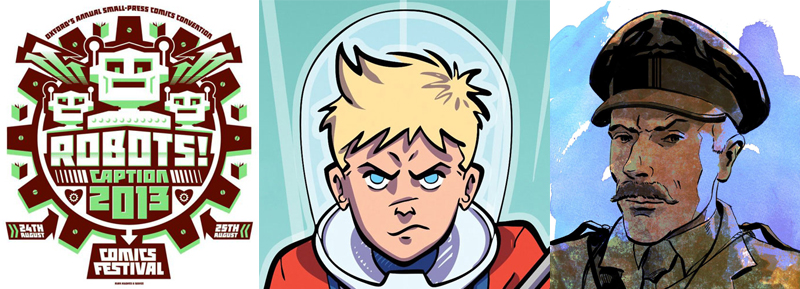
Caption_new blog 1.jpg292.19 KB This year’s August bank holiday isn’t just about the Edinburgh Book Festival’s graphic novel-focussed programme; it also sees some brilliant artists and writers gather in Oxford for Caption, the UK’s longest running comics festival. Showcasing the work of amateur and professional creators alike, this annual small-press convention has an impressive programme of events, which take place on Saturday 24th and Sunday 25th August.
Saturday 24th sees SelfMadeHeroes Andrzej Klimowski and Danusia Schejbal (The Master and Margarita), Paul Collicutt (The Murder Mile) and Rob Deas (Pride and Prejudice) discuss their work with comics podcaster Alex Fitch. The four creators, known for tackling both science fiction and real-world subjects, will discuss their approaches to both. ‘This brilliantly named ‘Self Made Robots’ panel will take place at 1.30pm.
Rob Deas and Paul Collicutt will also be talking children’s science fiction comics with John Aggs and David O’Connell at noon on Saturday.
Caption takes place at the East Oxford Community Centre, Cowley, Oxford OX4 1DD. The full programme is available here.
This October sees the inaugural Lakes International Comic Arts Festival take place in Kendal, Cumbria. Festival Director Julie Tait has put together the most extraordinary list of guests and programmed events: there’s something for everyone, from superhero creators to literary graphic novelists.
SelfMadeHero will be traveling to the Lake District with no less than six amazing creators, including Glyn Dillon (The Nao of Brown), Rob Davis (Don Quixote), David Hine (The Man Who Laughs) and I. N. J. Culbard (The Shadow Out of Time, Deadbeats). Oscar Zarate will launch his beautiful new graphic novel, The Park, at the festival and ILYA, author of the upcoming Room For Love, will also be there.
As well as signing and sketching throughout the weekend in the wonderfully named Comics Clocktower, they’ll be taking part in an array of events. Oscar Zarate will host a workshop for 8 fledgling artists (Oscar Zarate: A Masterclass, The Brewery Arts Centre, Sat 19 and Sunday 20, 10:00-13:00); I. N. J. Culbard, Rob Davis, David Hine and ILYA will discuss graphic adaptations of classics (Re-imagining the Classics, The Brewery Arts Centre, Sat 19, 12.15-13.15); and Culbard and Hine will also talk horror with Hannah Berry (Rocking With Horror, The Brewery Arts Centre, Sat 19, 20:00-21:15).
And if that’s not enough to keep you entertained, there are live drawing events throughout the weekend, including appearances from Glyn Dillon (Watch Them Draw, The Box, Sat 19, 14.00-15.00) and Oscar Zarate (Watch Them Draw, The Box, Sat 19, 15.45-16.45).
Tickets are now available for all events so book immediately to avoid disappointment.